Customer journey mapping with screenshots
Most journey maps document workflow logic and messaging but leave out the interface the customer actually saw. Here is how to map journeys with real product screens.
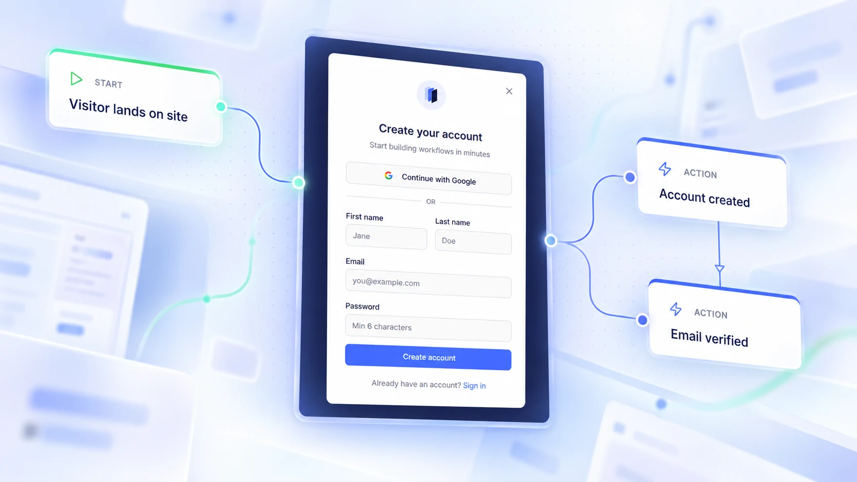
Customer journey mapping with screenshots: map what customers actually see
Customer journey mapping with screenshots means attaching the real interface a customer saw at a step directly to that step of the map, alongside the logic and the messages. Instead of a box labelled "Account created", the step carries the actual signup confirmation screen. The map then shows three things at once: what the customer does, what the customer sees, and what the customer receives. That is the difference between a diagram of intent and a record of the experience.
What is a Product Screen in customer journey mapping?
A Product Screen is a captured image of the interface a customer encounters at a specific journey step — a signup form, an empty dashboard, a payment failure state, a confirmation page — stored as part of that step rather than as a loose file.
The distinction matters. A screenshot in a shared drive, a slide, or pasted onto a whiteboard is an orphan: nobody can tell which step it belongs to, when it was taken, or whether it is still accurate. A Product Screen is bound to a journey moment, carries the date it represents, and stays connected to that journey context as teams review and maintain the experience.
Why add screenshots to a customer journey map?
Because the written description of a step is almost never the experience. "Customer verifies email" hides whether the verification page loaded instantly, whether it explained what happens next, or whether it dead-ended on a blank state.
Screenshots close four specific gaps:
- Accuracy. Teams stop arguing from memory about what a step looks like.
- Context for copy review. Message wording can be judged against the screen that precedes it.
- Onboarding for new teammates. A new hire understands the product from the map alone.
- Change evidence. When an experience is redesigned, the previous capture shows what changed.
This is the practical core of product experience mapping: pairing journey structure with visual reality so the map is usable by product, lifecycle marketing, support, and design at the same time.
Should every journey step have a screenshot?
No. Screens should be attached selectively, to steps where the interface carries meaning.
Good candidates:
- Entry points where a customer first commits — signup, checkout, invite acceptance
- Steps where confusion or drop-off is suspected
- Error, empty, and failure states, which are rarely documented anywhere else
- Screens that a communication refers to directly
- Moments that a redesign is about to change
Poor candidates:
- Internal or system-only steps with no customer-facing interface
- Decision nodes, which represent logic rather than a screen
- Repetitive screens that add visual noise without adding information
A journey map with a screenshot on every node is as unreadable as one with none. The value comes from the contrast: the steps that carry a screen are the ones worth looking at closely.
How do product screens and customer communications work together?
Product screens cover what the customer sees inside the product. Communications are the messages customers receive around that journey moment, including email, SMS, chat, push, or in-product messaging. Put together on the same step, they show the full moment.
An example. A customer finishes signup. The step carries the confirmation screen they land on, and the verification email attached to the same step. Reviewing them side by side surfaces mismatches immediately: the screen says "Check your inbox for a link", the email leads with a six-digit code. Neither artifact reveals that problem on its own. In a journey map that holds both, it is obvious in seconds.
This is the argument for keeping journey logic, screens, and messages in one place rather than three: workflow in a diagramming tool, screenshots in a folder, messaging in a campaign platform.
Current versus historical screens
Interfaces change. A journey map that silently overwrites its screenshots loses the one thing that makes visual documentation valuable over time — the ability to see what the experience used to be.
The practical rule is to treat each screenshot as a dated capture rather than a file to replace:
- One capture is the current screen for the step, and it is the one the map displays.
- Earlier captures are kept, not overwritten, so the step retains its history.
- Each capture records the date the screen looked that way, which is often not the date it was uploaded.
That distinction — captured date versus upload date — is worth being strict about. A screen captured in March and uploaded in September is evidence about March.
Best practices for keeping screens attached to meaningful moments
- Attach to the step, never to the canvas. A floating image drifts out of position and loses its meaning.
- Capture the whole state, not a cropped detail. Context around the element usually explains the behaviour.
- Record the captured date honestly, especially for screens pulled from older material.
- Document failure states deliberately. Error and empty screens are the least documented and most discussed.
- Recapture on change rather than on schedule. A new capture when the experience actually changes keeps the history meaningful.
- Keep the source URL where the screen came from, so the step can be re-verified later.
How Product Screens work in Aligne
Aligne is a collaborative workflow and customer journey mapping platform. Journey steps, the communications customers receive, comments, and review context live on one shared canvas. For the feature overview and film, see Product Screens.
Product Screens in Aligne work as follows:
- Product Screens attach directly to standard journey nodes. They are not separate canvas nodes or floating images.
- The current Product Screen appears inside the node itself, so the screen is visible while reading the journey.
- Selecting it opens the full, uncropped screen.
- A screen can carry a captured date and a source URL.
- The capture with the most recent captured date is shown as the current screen, while older captures are preserved.
- Product Screens are not included in public shares or embeds.
- Product Screens are available on Free, Pro, and Team plans. Reviewing previous captures — Product Screen History — is a Team governance capability, alongside version history and the audit log. See pricing for plan details.
Aligne does not perform automated screenshot capture, visual change detection, or Product Screen rollback. Screens are captured and attached deliberately by the people who own the journey. Full setup steps are in the documentation.
A short signup example
Take a four-step onboarding journey.
- Signup form. Attach the form itself. This is where field order, required fields, and social login options can be reviewed against conversion data.
- Account created. Attach the confirmation screen. Attach the verification email to the same step. Read them together and check that both describe the same next action.
- Email verified. Attach the post-verification screen. Teams frequently discover this step ends on a blank page with no clear path forward — which is invisible on a text-only map.
- First workspace created. Attach the empty state. Empty states set expectations for the whole product and almost never get reviewed.
Four screens, the communications around them, one map. A lifecycle marketer, a product manager, and a support lead can now review the same onboarding experience without opening four other tools.
Where to start
Pick one journey your team already argues about — signup, verification, checkout, cancellation. Map the steps, attach the communications, then add screens to the three or four moments where the interface genuinely carries the experience. That is usually enough to change the conversation.
For the reasoning behind how Aligne lays out imported journeys automatically, see why general-purpose graph layout isn't enough for journey maps. For a worked journey with real communications attached, see designing an email verification journey.
Try Aligne with your team
Bring journey logic, product screens, and customer communications into one shared view. Free to start, no credit card required.